CASE STUDY / BRAND & WEB EXPERIENCE

KINSER

Focus
Branding, Visual Consistency, UI/UX
Year
2026
Brand Identity
Website Design
Development
Laptop on clear acrylic chair showing AI-powered interview tool website for faster hiring.
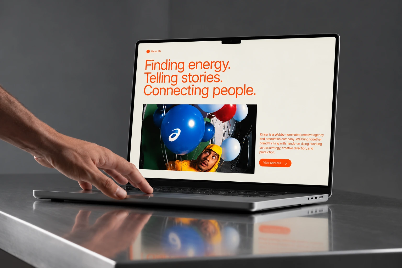
Aluminum laptop on a reflective metal surface displaying a webpage with the text 'Finding energy. Telling stories. Connecting people.' in large orange font and a photo of a person in a yellow hoodie looking at blue and red balloons, accompanied by a description of Kinser as a creative agency and a bright orange 'View Services' button, with a hand reaching toward the laptop keyboard.
The challenge

Kinser, a West Coast creative agency specializing in social-first storytelling, needed a visual identity that reflected its creative energy while helping the agency stand out in a competitive industry. The challenge was to create a brand foundation that felt distinctive, modern, and aligned with Kinser’s forward-thinking approach to helping brands connect with their audiences.

Beyond the logo and visual identity, the website needed to serve as a digital showcase of Kinser’s capabilities. It had to feel visually engaging while still being easy to navigate, responsive across devices, and structured in a way that helped visitors quickly understand who Kinser is, what they offer, and why they’re a strong creative partner.

The goal was not only to make the brand look polished, but to support user engagement and conversion. Every design decision — from the logo and typography to the website layout, navigation, responsiveness, and calls to action — needed to help create a more persuasive and memorable digital presence for the agency.

View WebsiteView Website
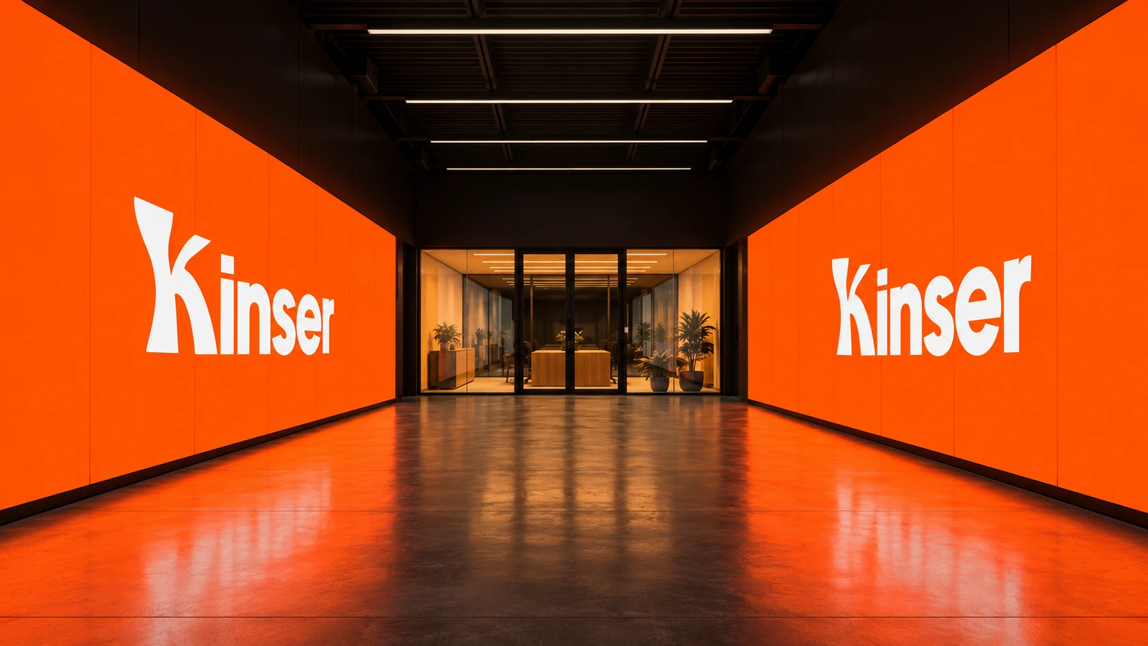
Symmetrical corridor with polished floor reflecting two large bright orange LED walls displaying the white word Kinser on each side, leading to a glass-walled office space with plants and warm lighting.

Logo Design

The Kinser logo was designed to feel bold, modern, and adaptable — reflecting the agency’s forward-thinking approach to creativity and social-first storytelling. Its clean letterforms and confident structure create a strong visual presence, while the simplicity of the mark allows it to work seamlessly across digital, social, and branded touchpoints.

By balancing personality with clarity, the logo gives Kinser a distinct identity without feeling overly complex or trend-driven. The result is a flexible brand mark that feels polished, memorable, and aligned with the agency’s role as a creative partner for modern brands.

White stylized text spelling 'Kinser' on a black background, with the letter 'K' having a unique, artistic form.
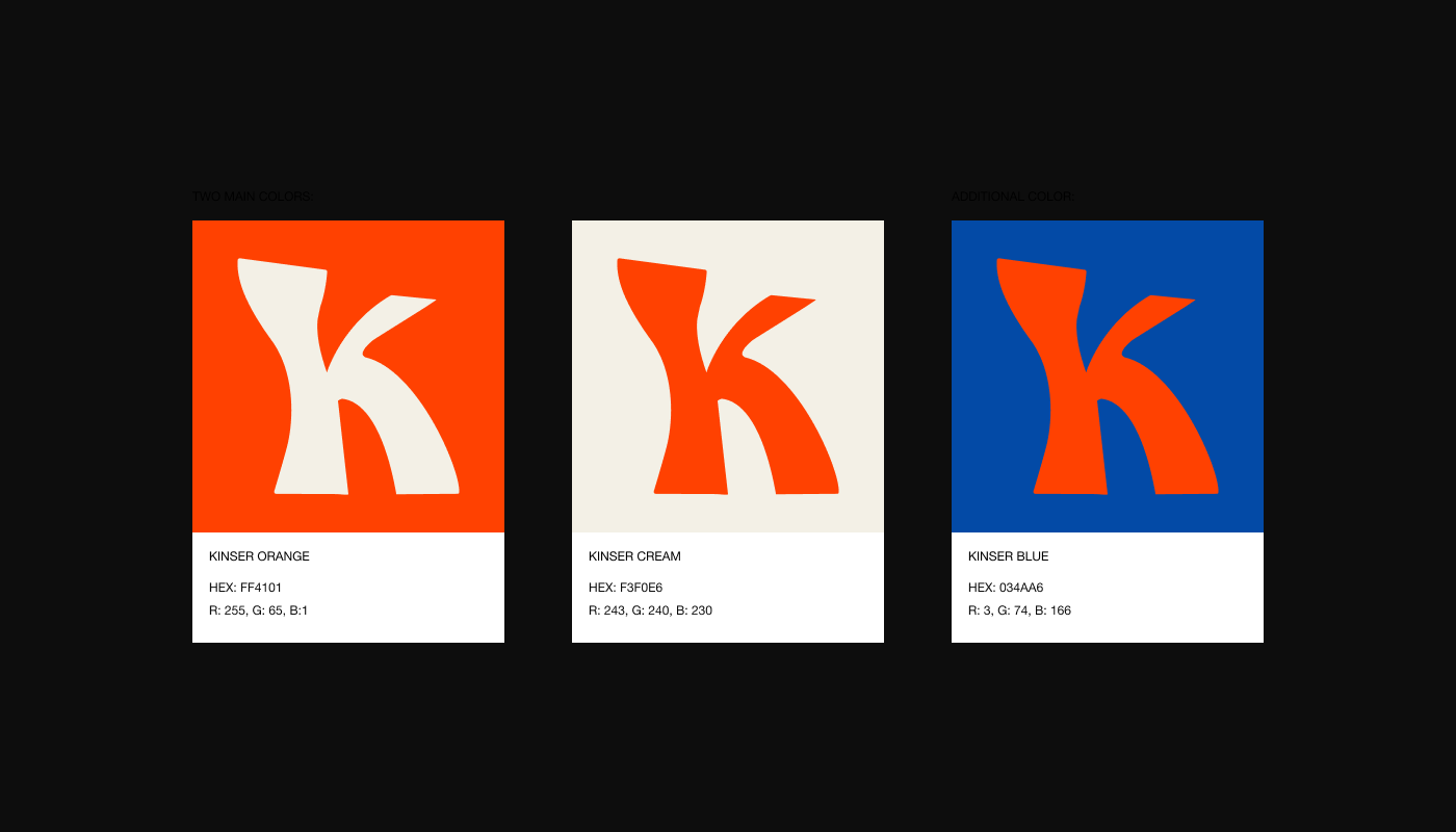
Three color swatches each with a stylized letter 'K' in contrasting colors; the left swatch has a Kinser Orange background with cream letter and includes HEX FF4101 and RGB 255, 65, 1, the middle swatch has a Kinser Cream background with an orange letter and includes HEX F3F0E6 and RGB 243, 240, 230, the right swatch has a Kinser Blue background with an orange letter and includes HEX 034AA6 and RGB 3, 74, 166.
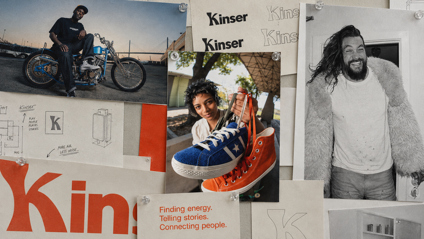
A collage of pinned photos and sketches on a board featuring a man sitting on a blue motorcycle, a person holding up a pair of sneakers—one blue, one orange—a black and white photo of a smiling man wearing a fur coat and white shirt, and sketches with the word 'Kinser' and phrases like 'Finding energy. Telling stories. Connecting people.'
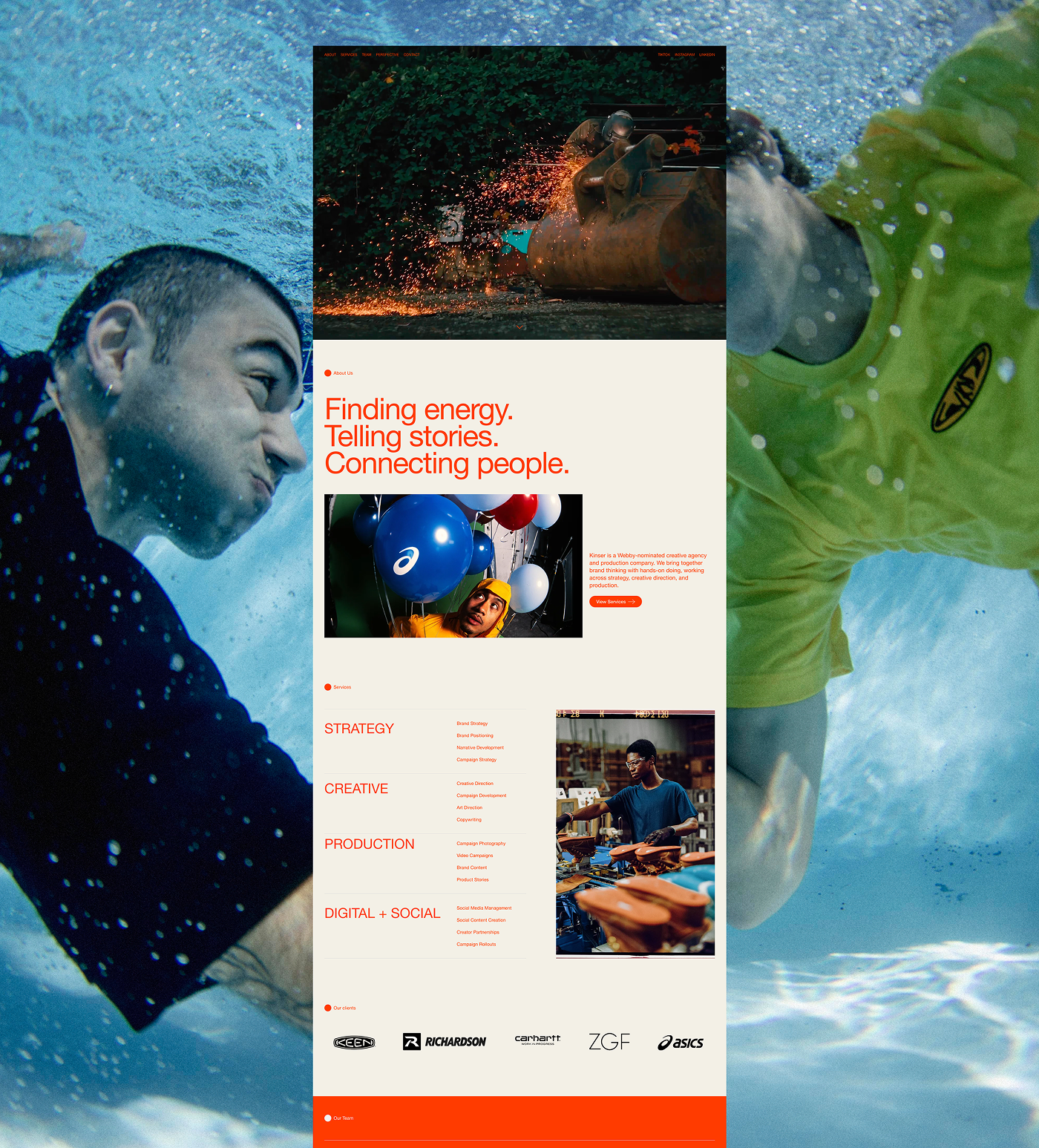
Website screenshot showcasing Kinser, a creative agency website, with a header image of sparks flying from a welder working on machinery. The page highlights the tagline 'Finding energy. Telling stories. Connecting people.' There are pictures of people involved in creative work and images of balloons and shoe production. Below is a list of services: Strategy, Creative, Production, Digital + Social, each with detailed offerings, plus logos of clients including KEEN, Richardson, Carhartt, ZGF, and ASICS. The design uses orange text on a beige background.
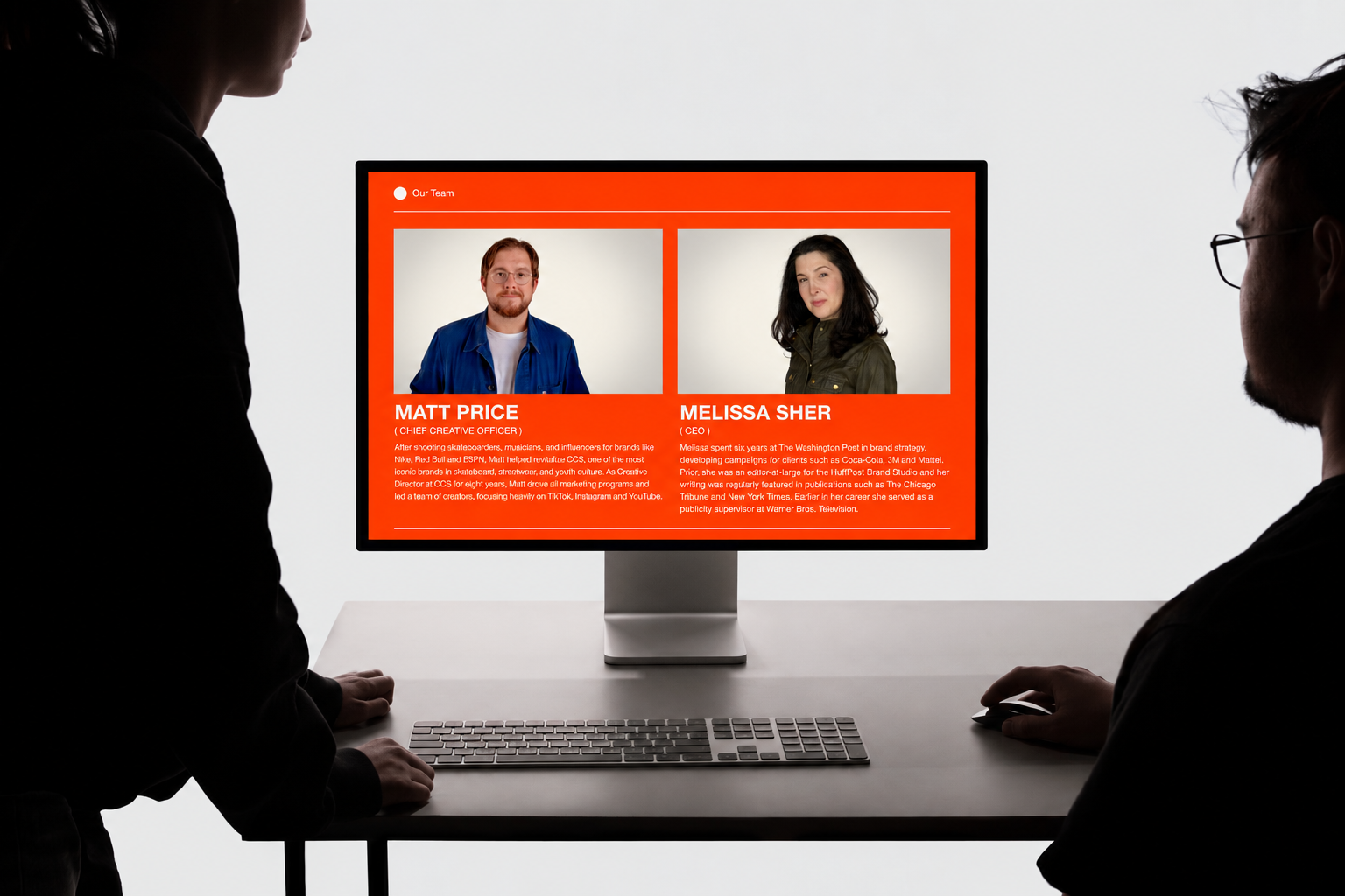
Two people in silhouette view a desk setup with a silver keyboard and mouse in front of a monitor displaying a bright red 'Our Team' webpage featuring portraits and bios of Matt Price, Chief Creative Officer, and Melissa Sher, CEO.
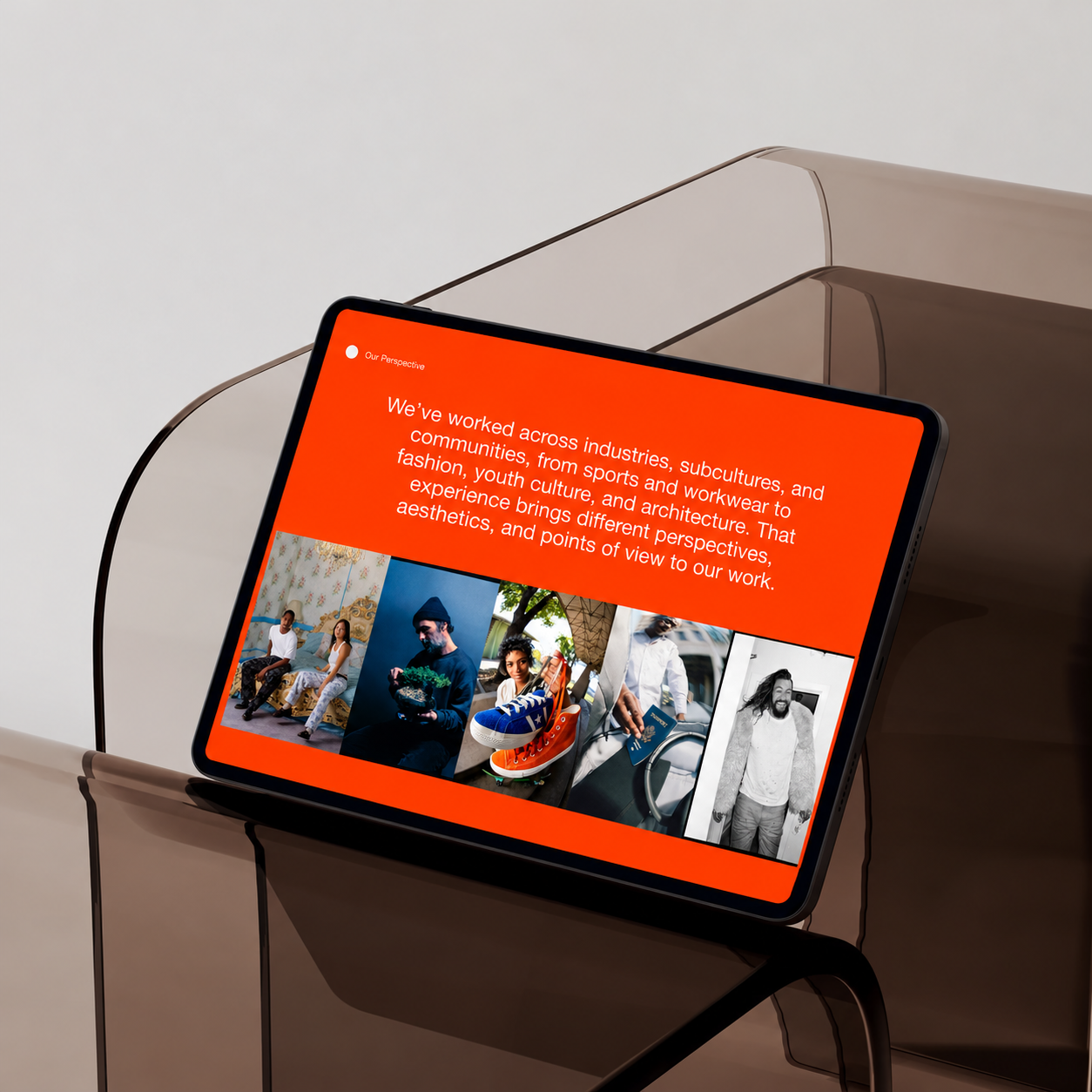
Tablet displaying a webpage section titled 'Our Perspective' with white text on an orange background describing diverse industry experience; below the text are five small photos showing diverse people and objects including two seated individuals, a man holding a plant, a person holding colorful sneakers, a person with a passport, and a smiling man in casual clothes. The tablet rests on a translucent brown chair against a plain light background.
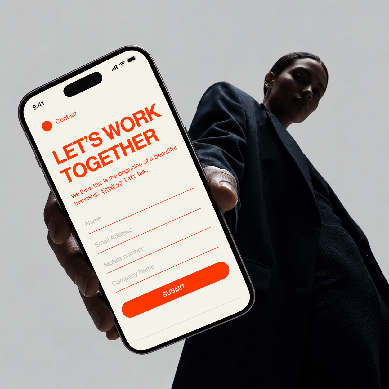
Person holding a smartphone displaying a contact form with bold red text that says LET'S WORK TOGETHER and fields for name, email address, mobile number, company name, and a red submit button.

Website Design

The Kinser website was designed to translate the agency’s creative identity into a polished and engaging digital experience. The layout balances bold visual moments with clear structure, allowing the brand’s personality to come through while keeping the user journey simple, intuitive, and easy to navigate.

Every section was built to help visitors quickly understand Kinser’s capabilities, explore their services, and feel confident in the agency’s creative direction. Through responsive layouts, thoughtful spacing, strong typography, and clear calls to action, the website creates a digital presence that feels modern, professional, and built to support engagement and conversion.

Next Work

Rich Gay Aunt

2025
Four hands holding various black Rich Gay Aunt hair care products—including sea salt spray, light matte cream, matte clay, define creme, and volumizing powder—against a clear blue sky.