.webp)

.svg)
Turning first-time users into active members
.webp)
Lika Living came with a clear vision, but no established brand identity or digital home. They wanted something that felt refined, calm, and editorial — almost like flipping through a beautifully designed book, where each page reveals another elegant living space.
The challenge was to build that foundation from the ground up. This meant creating a logo, color palette, and visual identity that felt modern and timeless, while also designing a website structure that could showcase properties in a serene, immersive, and easy-to-explore way.
The site needed to feel minimal and elegant without sacrificing usability. Horizontal scrolling helped bring the page-turning concept to life, while careful attention to navigation, responsiveness, whitespace, and interaction design ensured the experience stayed clear, seamless, and purposeful across devices.
View WebsiteView Website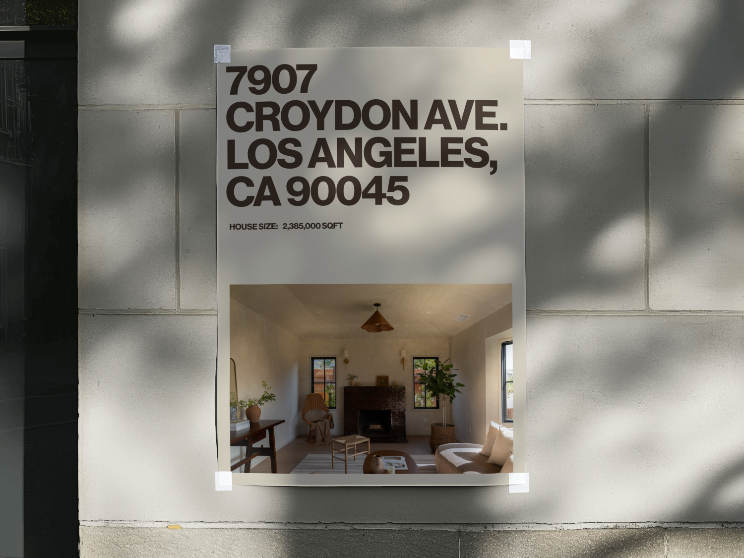
The brand identity was designed to feel calm, minimal, and timeless — reflecting Lika Living’s refined approach to showcasing elegant properties. Since the brand was starting without an existing visual system, the goal was to create a foundation that felt polished from the beginning while remaining flexible enough to grow across digital and print touchpoints.
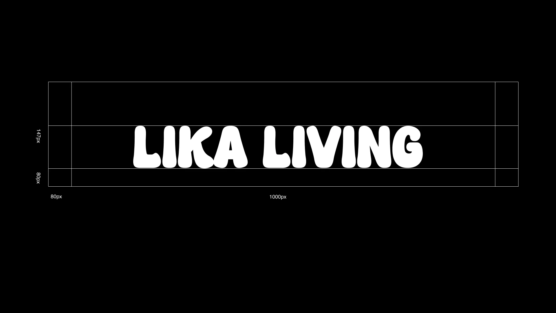
The logo was created to feel simple, sophisticated, and adaptable. Its clean structure gives Lika Living a recognizable mark without overpowering the quiet, editorial feel of the brand. Paired with a soft color palette and understated typography, the identity creates a sense of calm confidence and visual consistency.
Every brand decision was made to support the feeling of elevated living. The result is a visual identity that feels modern, serene, and intentional — giving Lika Living a stronger foundation for presenting its properties with clarity and elegance.
.png)
.png)
.webp)
.webp)
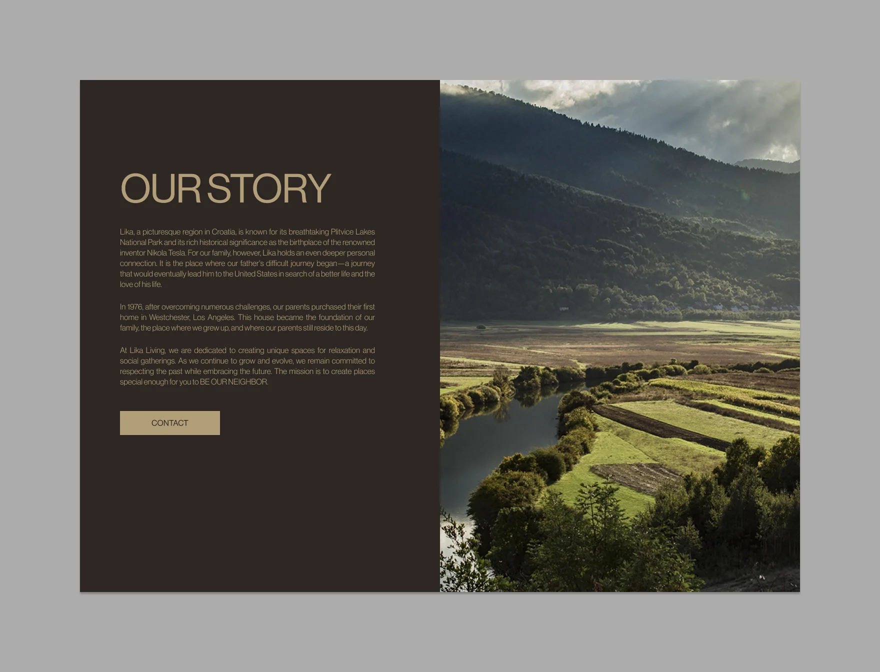
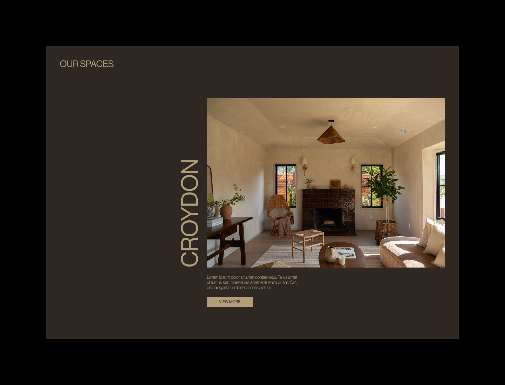
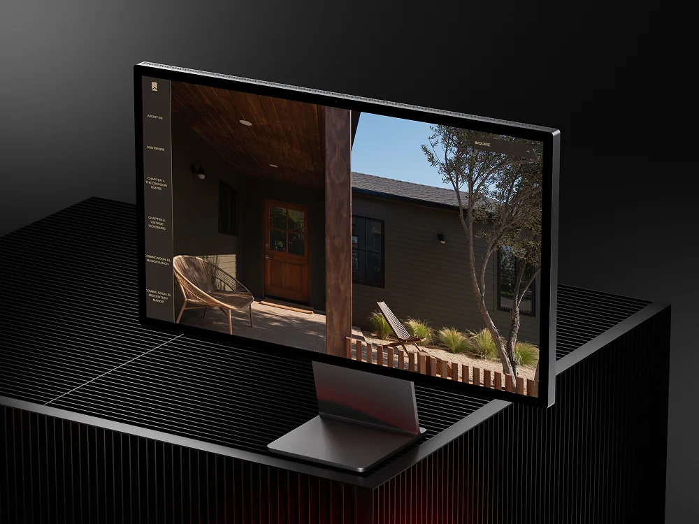
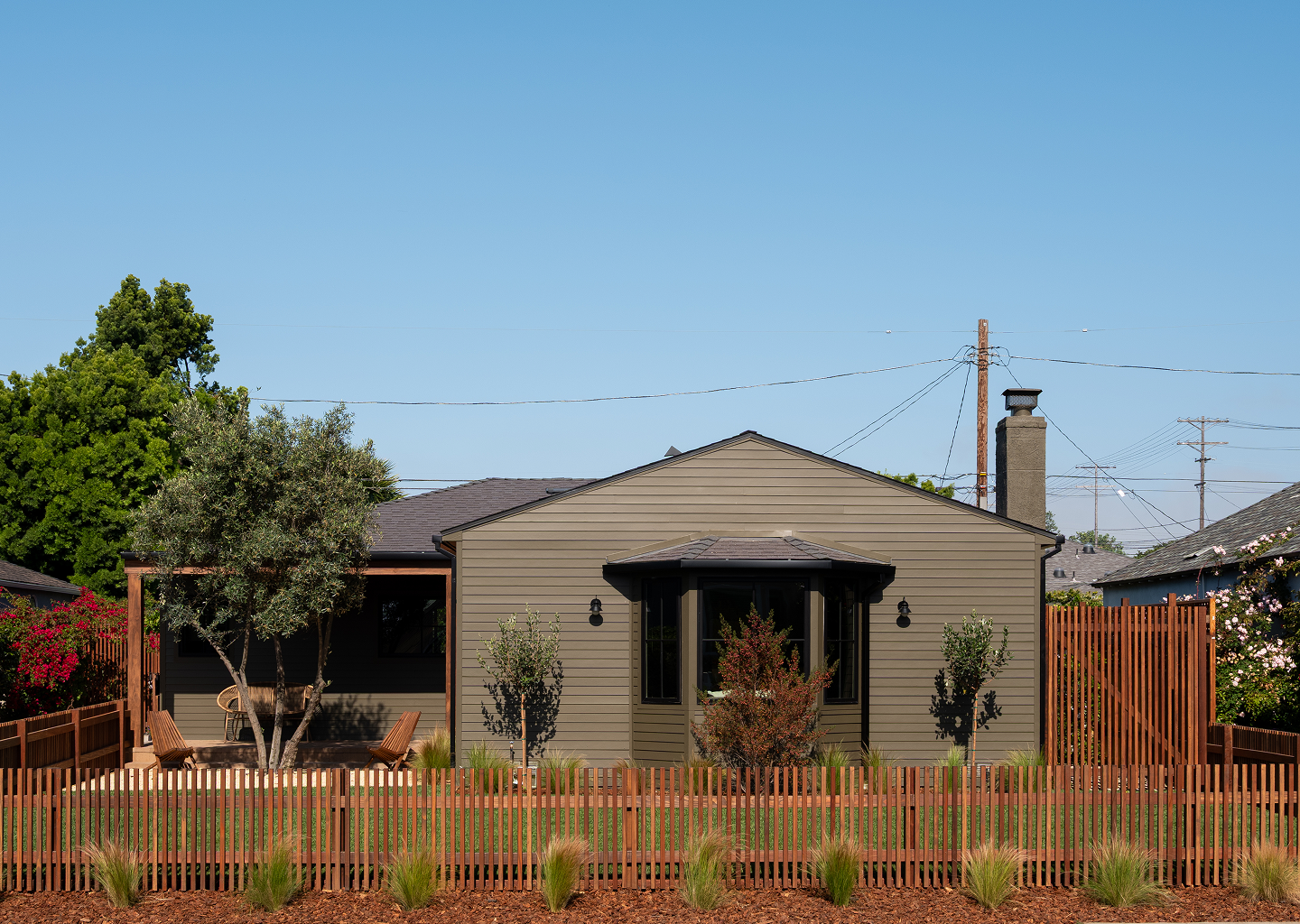
Lika Living’s website was designed to feel like moving through a beautifully designed book, with each section revealing a new part of the brand and property story. The horizontal flow, warm color palette, and spacious layouts helped create a sense of calm progression rather than a standard scrolling website.
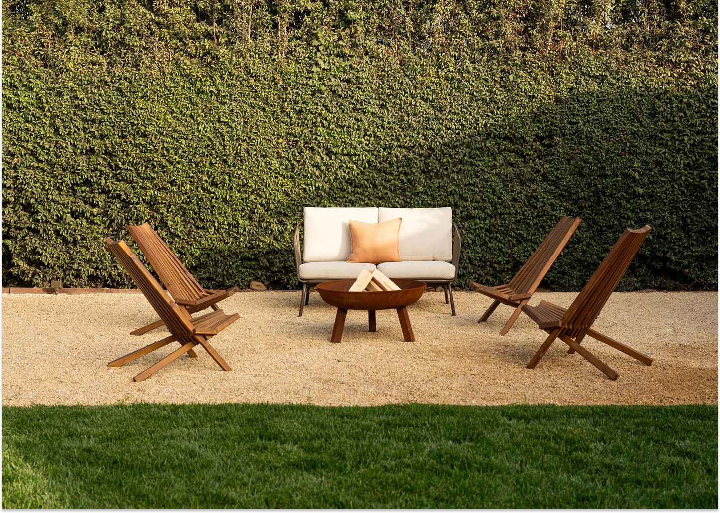
The experience focused on making the properties feel elevated and easy to explore. Large imagery, minimal copy, and deliberate transitions gave each space room to breathe, while the mobile experience kept the same refined visual language in a more compact format.
The final Webflow build brought the identity to life through a polished, responsive website that feels serene, memorable, and aligned with Lika Living’s vision of modern, intentional living.
Lika Living came with a vision but no brand identity or digital home. They wanted something that felt like flipping through a beautifully designed book—where each page turn reveals another elegant living space. I helped bring that vision to life by designing their logo, establishing a clean brand identity, and building a website in Webflow that captures that sense of calm progression.
As a key contributor to Lika Living’s journey, I played an integral role in shaping their visual identity from the ground up. I was instrumental in creating their distinctive logo, meticulously crafting a mark that embodies their refined and modern approach to living spaces. Alongside this, I designed and developed their website, ensuring it wasn’t just functional but also aligned with their vision: a digital experience that feels like flipping through the pages of a beautifully designed book. Each section unfolds with elegance, showcasing their houses in a serene, editorial-like flow that reflects the brand’s calm and sophisticated essence.
Lika Living came to the table without a logo, color palette, or branding — just an elegant vision. The challenge was twofold: to create a visual identity that felt both modern and timeless, and to develop a mark flexible enough for both print and digital contexts.
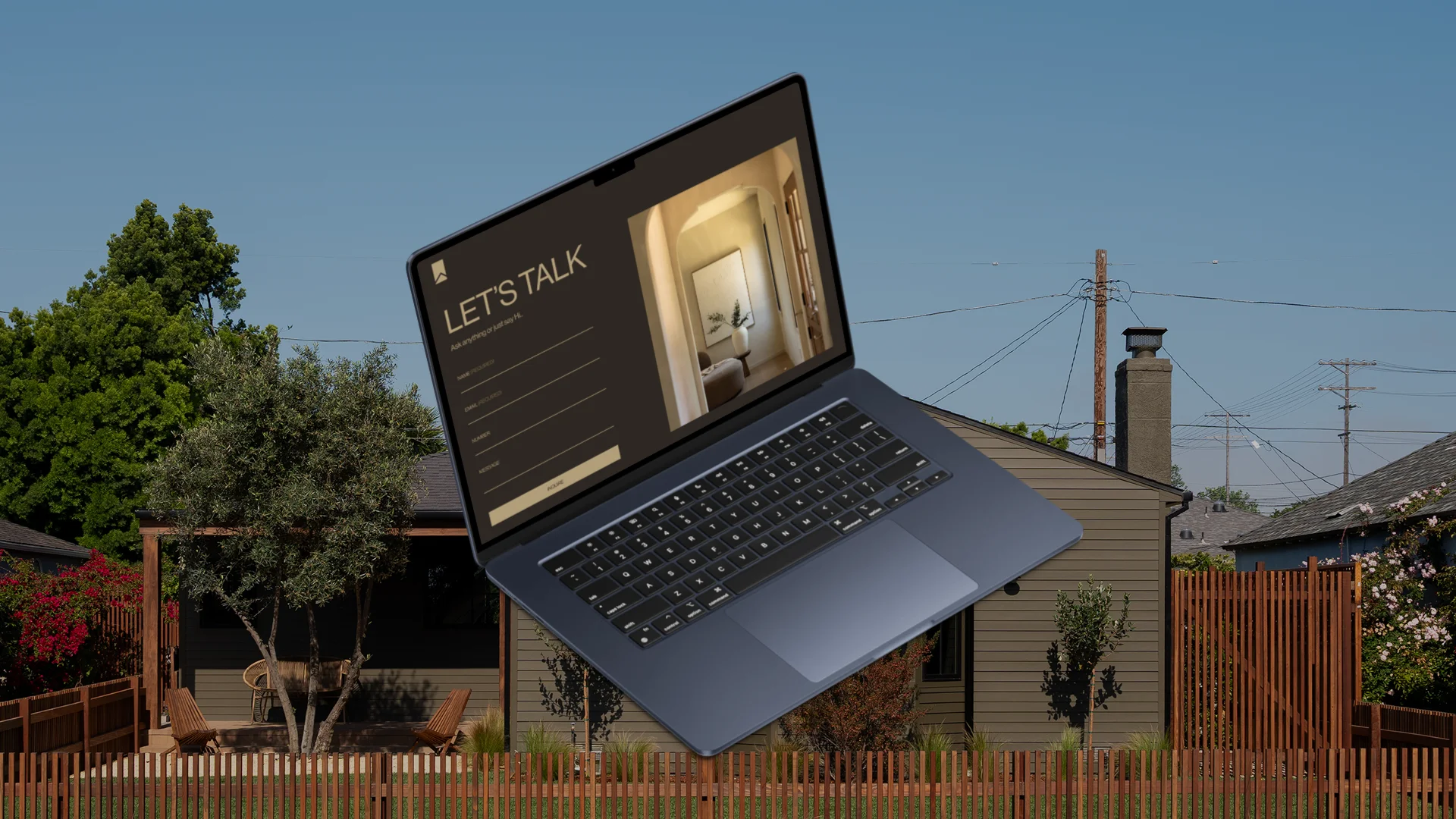
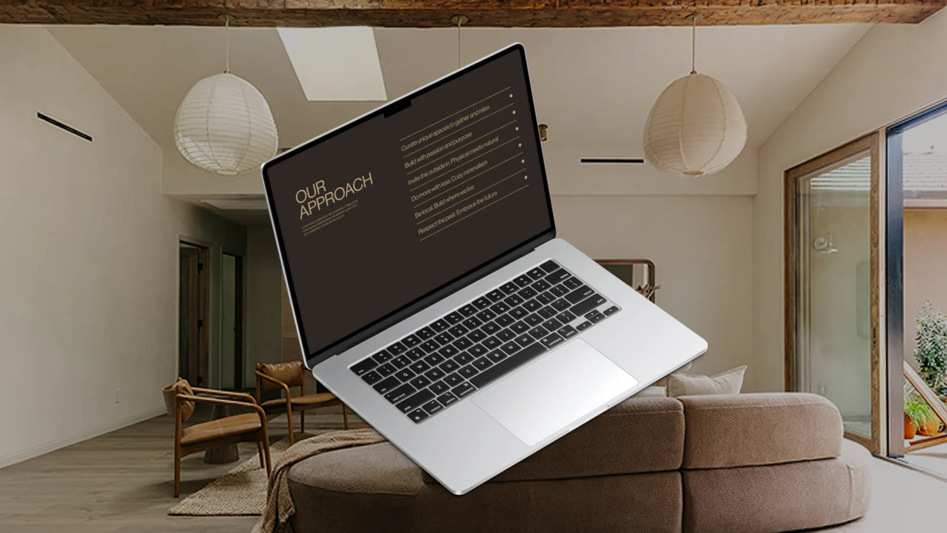
Rather than a typical scrolling website, Lika Living wanted their site to evoke the experience of flipping through a beautifully designed book — where each “page” reveals a new, serene living space. The challenge lay in translating that tactile, intimate experience into a clean, intuitive UI that still feels editorial and deliberate. To achieve this, I introduced horizontal scrolling, which allowed the content to flow seamlessly from one section to the next, mirroring the rhythm of turning physical pages.
A minimalist, elegant site can easily sacrifice usability. For Lika Living, the challenge was to preserve the visual serenity and whitespace-centric design while ensuring navigation was seamless, interactive elements were purposeful, and responsiveness was flawless across devices.
I designed Lika Living’s entire visual identity from the ground up. The logo was crafted as a timeless mark that reflects sophistication and calm, while the branding system emphasized muted tones, elegant typography, and modern minimalism. Together, these choices built a strong foundation that felt high-end but approachable — perfectly aligned with the brand’s vision.
To replicate the feeling of flipping through a beautifully designed book, I used horizontal scrolling to create a seamless, page-turning flow. Each section was designed as its own “spread,” showcasing properties with a sense of rhythm and discovery. This approach turned the website into a narrative experience, letting users explore homes in a way that felt intimate, editorial, and deliberate.
I built the site with a design-meets-function mindset. Clean navigation ensured ease of use without disrupting the minimalist aesthetic, while interactive elements were subtle but intentional. Responsiveness was refined across all devices to guarantee usability without compromising visual serenity. The result was a site that feels calm and refined, yet practical and accessible.
.png)
My collaboration with Lika Living resulted in a distinct visual identity and a website that feels like turning the pages of a book. From logo design to horizontal-scrolling editorial layouts, I helped craft an immersive digital experience that balances elegance with usability. This case study highlights how intentional design can transform a brand into a story, making every interaction feel deliberate and refined.
.svg)